I don’t even remember how I first met Joni in blogland, but we’ve been friends and email buddies for awhile now. I so admire her design sense and she is also SO down to earth (and witty), even though she’s miles ahead of me in putting a room together (and I’m just a wee bit jealous over that!). I guess you could say she is my decorating mentor. I have long admired her own beautiful house and how it has evolved into the sumptuous and elegant space that it is. It’s magazine worthy for sure, yet still very approachable. And that I really admire about Joni.
Joni’s family room was featured in the October issue of Better Homes and Gardens and it was so fun to open the magazine that came in my mailbox that month and have a friend step off the pages. Thanks, Joni for coming by and sharing with my readers the story of your guestroom. I didn’t realize at the time that both rooms were up for consideration to be published with BHG. If you haven’t met Joni yet, go on over to Cote de Texas and take a look at French style decor done well, from a Texas point of view.

Not too pretty, is it? It USED to be really cute before my daughter Elisabeth grew up! This was her bedroom, originally. She was around three years old when we moved into our house and Ben and I thought she would be in this bedroom until she left for college. Ah, such wishful thinking!! The decor actually came from her nursery – it was all a Waverly flowery chintz in pink and green mixed with a pink and white ticking. The iron day bed had a bedspread made out of the ticking with the chintz pillows and my mother-in-law made the quilt on top of the bed to match the room. All the window treatments were made out of the chintz – faux Austrian shades on top of wood blinds. There was a window seat cushion made out of the ticking with more chintz pillows and an area rug that was my favorite thing in the room. It was a flat weave dhurri made to resemble a needlepoint with sections that looked like flowers. It was really pretty until it became stained with paint, ink, glue, and spilled drinks. In desperation I even tried covering the stains with white-out!!!! The wallpaper was an English styled mini pattern, pink on white.
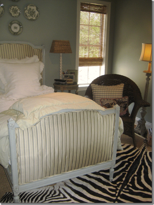
When Lizzy grew older, she announced she no longer liked this room and she moved to another bedroom that is actually much smaller and without any charm at all. Since that time, she has gone through two decors – the latest one a purple West Elm vision that she now wants to change, yet again. After she vacated this room, it languished half empty – and became a sort of junk room for everything that had no other place to go. Eventually I bought a French day bed at an antique store that they were practically giving away – so it was impossible to resist. I had it upholstered in a green and cream silk stripe and slowly I started the clear out the junk room. I had my painter remove the wallpaper and I put up a greenish-blue color on the walls. A clean seagrass rug replaced the once adorable dhurri. All the curtains came down and were replaced by shades I bought at Target, my favorite source for those kinds of shades. I hung some green and white transferware plates above the bed instead of art work. Finally and sadly, the last remnants of my child’s babyhood were given away. The now so-called guest room stayed in this half finished stage for a few years until I was asked to put my house in Houston House and Home magazine. Finally, I had a real reason to justify to Ben why I needed to fix it up, because surely – we don’t have many overnight guests.

The guest room before I knew it was to be photographed for a magazine. Notice the lamps and the way the shades were hung – inside the frame. Once I added the curtains, I raised the shades to the ceiling.
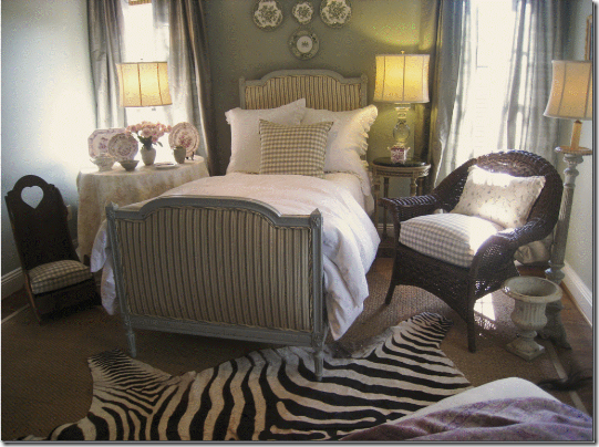
The photo shoot for Houston House and Home was scheduled rather quickly so I had to move fast to get the room finished. There wasn’t any time for custom curtains, so I went to Restoration Hardware to get them; their green silk striped curtains almost matched my daybed material, so they were perfect! I re-hung the shades right under the ceiling – so as to hide the space between the window and the curtain rod. The curtains were then hung under the crown molding. Hanging the shades and curtains this way creates a long, vertical line that helps to make the ceiling appear higher and it has a cleaner look. I replaced the green and white bedding with all white linens that came from the now shuttered Linens N Things. The new lamps also came from Restoration Hardware, on sale – God bless Restoration Hardware – they were a lifesaver trying to put this room together in about a week’s time. I added an orange pillow for a little extra color, which I just loved. It wasn’t perfect, but I thought the room looked pretty good, especially since everything was bought with a budget in mind, either on sale, or at a discount store.

The night before the photo shoot, I took this picture of the window seat – notice there was no cushion on it. The orange suzani was later draped over the chair for the pictures.

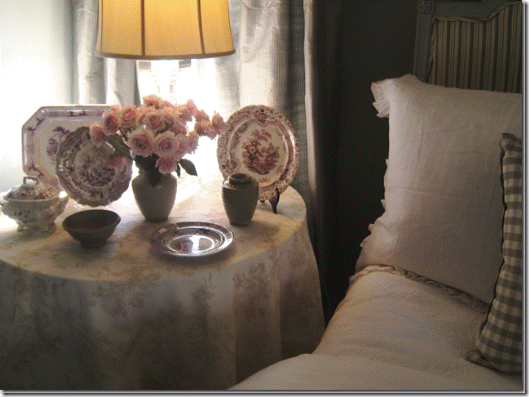
This is the actual picture that was in the magazine and I was really proud of the room – I thought I had it had a certain flair, but looked classic at the same time. The problem was Better Homes and Gardens didn’t agree with me! More about that later. The skirted table was left over from an unhappy client – it was made out of Bennison, but when the fabric came in, it looked nothing like the sample so I luckily got to keep it instead. From afar it looks almost like a plain white fabric, but up close it has very muted roses all over it. Here you can see the new Restoration Hardware lamps and curtains, which were hung from the ceiling, instead of at the top of the window. The bed is dressed in all white linens, with the little orange pillow for a color pop.
After my house was published in the Houston magazine, a local scout for national magazines contacted me asking if I would like to be in another magazine. MOI? Such free publicity for an interior designer is really hard to turn down, plus she told me I would get to publicize my blog in the article which I was really excited about. The magazine turned out to be Better Homes and Gardens and they informed me they were really interested in only two rooms – my family room and my guest room. Why they picked those two rooms, I will never know, but that’s what was decided from the upper management. We had a date set for months in advance and since they had already seen the rooms, I figured they were happy with them. I couldn’t have been more wrong. Less than a week before the shoot, the scout received a fax from BHG detailing everything they wanted changed in my house. The list was long and the changes were going to be quite expensive, something I really had not planned on or budgeted for. This news sent me into a major panic mode, wondering why they hadn’t asked for all the changes before – instead of giving me just one week to get ready.

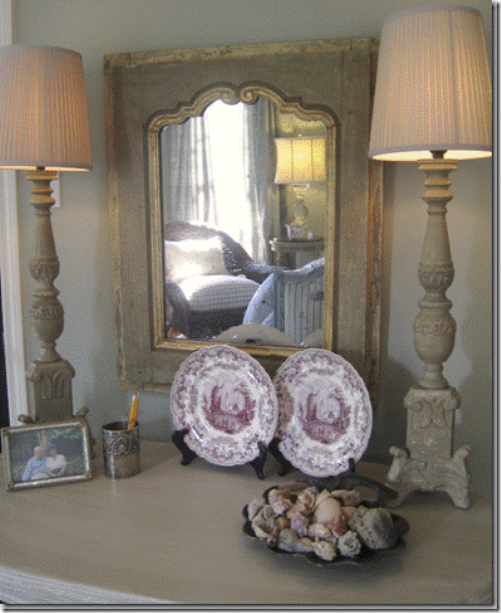
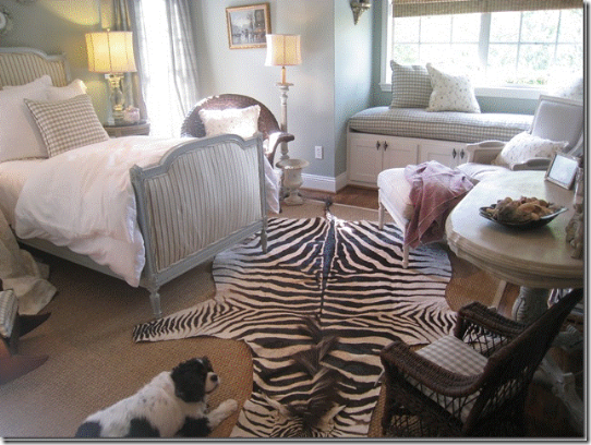
The desk across from the bed, decorated with shells we’ve collected at South Padre Island and a picture of Ben’s beloved parents.
What exactly did BHG want to change? For starters, the zebra rug HAD to go. BHG informed me that in their surveys, most readers say they hate to see zebra rugs and object to them on principle. That request was easy to take care of. Also, the orange pillow had to go – it stuck out too much. Ditto the suzani. They wanted more cushions and pillows added and they also wanted a window seat cushion made. That was the hardest request – they asked that it be made out of the Bennison fabric. I knew there was no way in one week’s time I could get the fabric from England much less have it made into a window seat, so I begged the Houston scout to let me use some extra fabric I had in the garage left over from a job. I think she was as desperate as I was, so she agreed to this. Plus, Bennison is quite pricey, something I really wanted to avoid. They wanted something on the blank wall across from the bed. They wanted pictures hanging in the window seat area. They wanted the room to look cozy and warm and more country, less hip, not that it was truly hip in any way. Eclectic was a better description. Besides the changes in the guest room – there were other requests for the family room – and everything started to add up. Frantically I called Monica of Custom Creations by Monica, my partner who facilitates all the soft goods for my business – the measuring, the pillows, bedding, curtains, etc. At this point I was truly a wreck and came within an inch of canceling the entire shoot. Monica really pulled through for me and a few days later, after spending untold dollars on rush orders, she returned to my house with an armful of pillows and cushions – all in the Chelsea Editions seafoam check and another Chelsea Edition embroidered fabric that was in my garage. I could have hugged Monica! She really saved my life that week. I’ll never know how she got her workroom to finish everything in time, but she did. The photo shoot for Better Homes and Gardens went off without a hitch and I was left with a finished guest room, finally, after all those years!

Here’s is what the guest room looked like the day Better Homes and Gardens photographed it. The orange pillow was gone, so was the zebra. The check pillow is on the bed, and the wicker chair has a new checked cushion with the embroidered pillow. It does look much softer and cozier I have to say – so maybe BHG knew what they were talking about after all!

We styled the skirted table differently – using the purple and white transferware that used to be downstairs. We added the sweet pink roses to match the roses on the fabric. In this picture you can see the muted pattern on the Bennison fabric much better.

The window seat saw the most changes with the addition of the down filled cushion and extra pillows. We added the sconces on each side of the window, with an oriental art object on each. On the chair, we added a lilac throw where before there had been the bright suzani that matched the orange pillow. I really liked the way this area turned out.

Across from the bed was an empty spot that needed to be filled, so I ran to Indulge Decor and bought this little table to double as a desk for my non-existent guests to write a letter home. The lamps were from Indulge too, Blanc d’ivoire. I rushed to IKEA to finds shades that fit the European styled harps. Monica added a little cushion to the child sized wicker chair. Unfortunately, BHG didn’t take a picture of this area, so I could have saved my money! In the end, the shoot took an entire day for just the two rooms. My family room was in the October 2008 issue, but my guest room has never made an appearance. They told me a few months ago it would be in the May issue, but now, it's been put on the back burner. If it never does appear – I guess I would have spent all this money for nothing, but still – my room is finally finished and I am happy with it.

The final issue with the guest room was the zebra rug – whether to put it back into the room or not. I had a poll on my blog asking whether I should use it, and most people said no – they liked my guest room better without it. Well, I didn’t listen! haha!! I had no other place for it, so back it went. But, I am seriously thinking of moving it down to my family room. I’m making a few changes in there and the zebra might just look better there.

After all this time, and all these years, my “guest” room is finally finished. I keep the door to it closed, to keep my dogs from jumping on the window seat to look out at the street. I’m such a meanie! Sometimes, I go in there just to look at it – it’s the one really clutter-free room in the house. My husband suffers from migraines and he used to come in this room to sleep and watch the TV, but no more – since the TV is now long gone. My daughter has hinted many times that she wouldn’t mind moving back in here now that it is all finished – but that’s not going to happen! I like having one room in my house camera ready – for what, I have no idea. In truth, it’s all facade: don’t open the closet door. It’s filled to the top with everything imaginable.
Rhoda, thank you so much for inviting me to be a part of your blog! It’s been so much fun getting to know you and hopefully, one day soon – we’ll meet in person!
Thank YOU, Joni for coming by to share with all of us the story of your tres elegant guestroom. I love this room so much and hope all of you enjoyed the transformation as much as I did. And Joni, I'd love for you to come to Birmingham and go yardsaling with me. :)


